
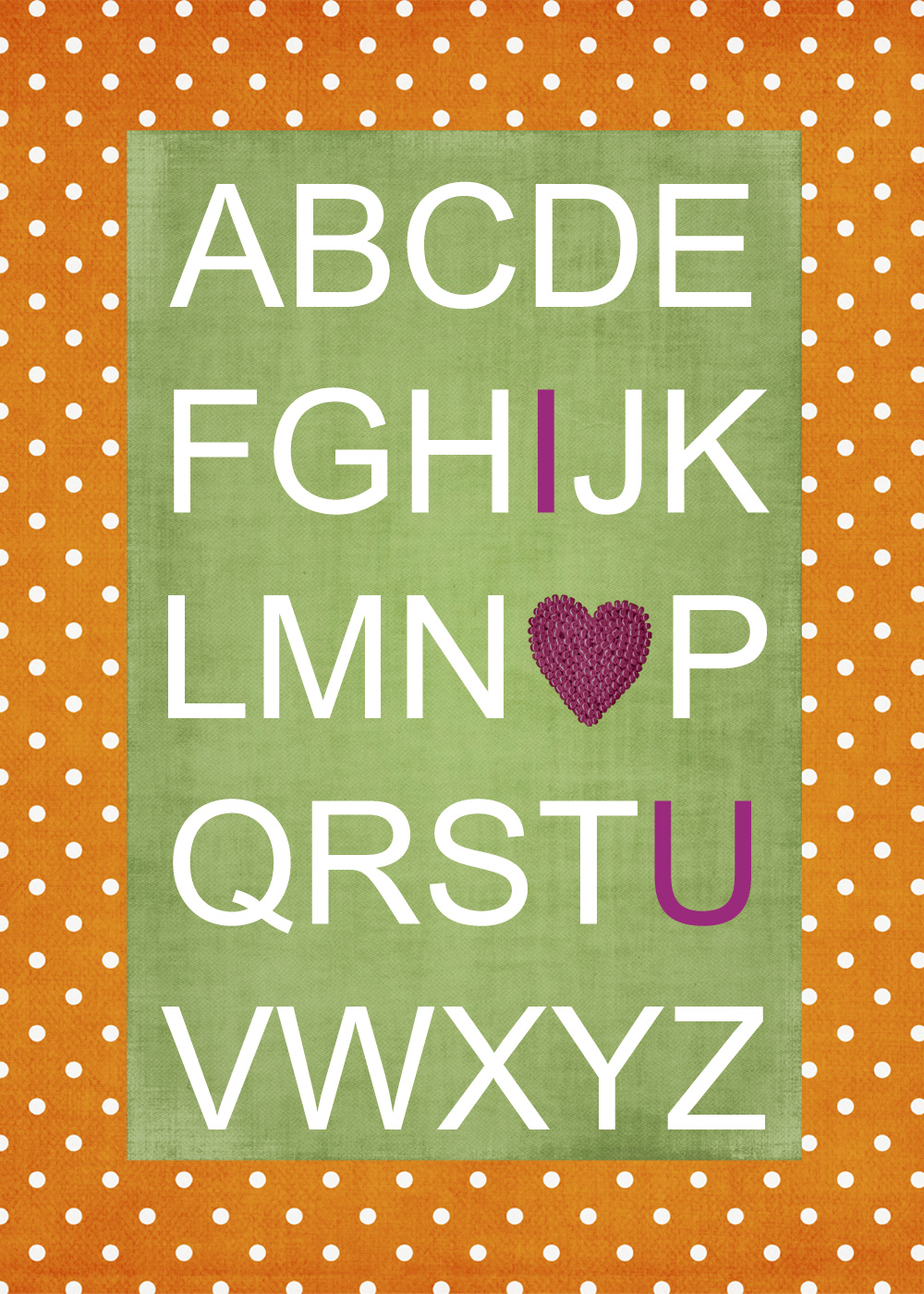
So, we still have a few prints to hang in Little’s room. There’s this that I ordered from Kiki. I have it matted in an orange and white polka dot matte that I made to match this:
Then, tonight I put together this treasure:
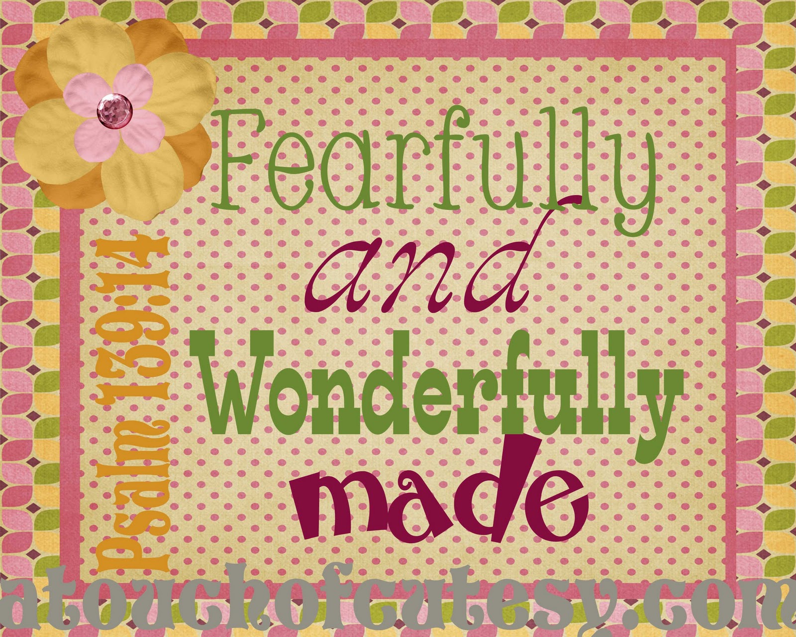
I’ve wanted to have this verse in her room for so very long. haven’t decided if I think this is too busy (of course the website will come off!). You can chime in with your opinions if you like.

They will look great in her room! The only thing I noticed on the second one, was that it was hard to read the reference. Maybe a color change????
So cute! Maybe too many fonts?
I don't like the background polka dots. What a great psalm…not familiar with that one..I like!
I just love the ABC design! As for the other, (IMO) I think two fonts would be enough. And maybe only one color to reduce the busyness, but two might work. Either way, I love the verse!